HOME
SION
Meeting the city where it is.
BRAND IDENTITY
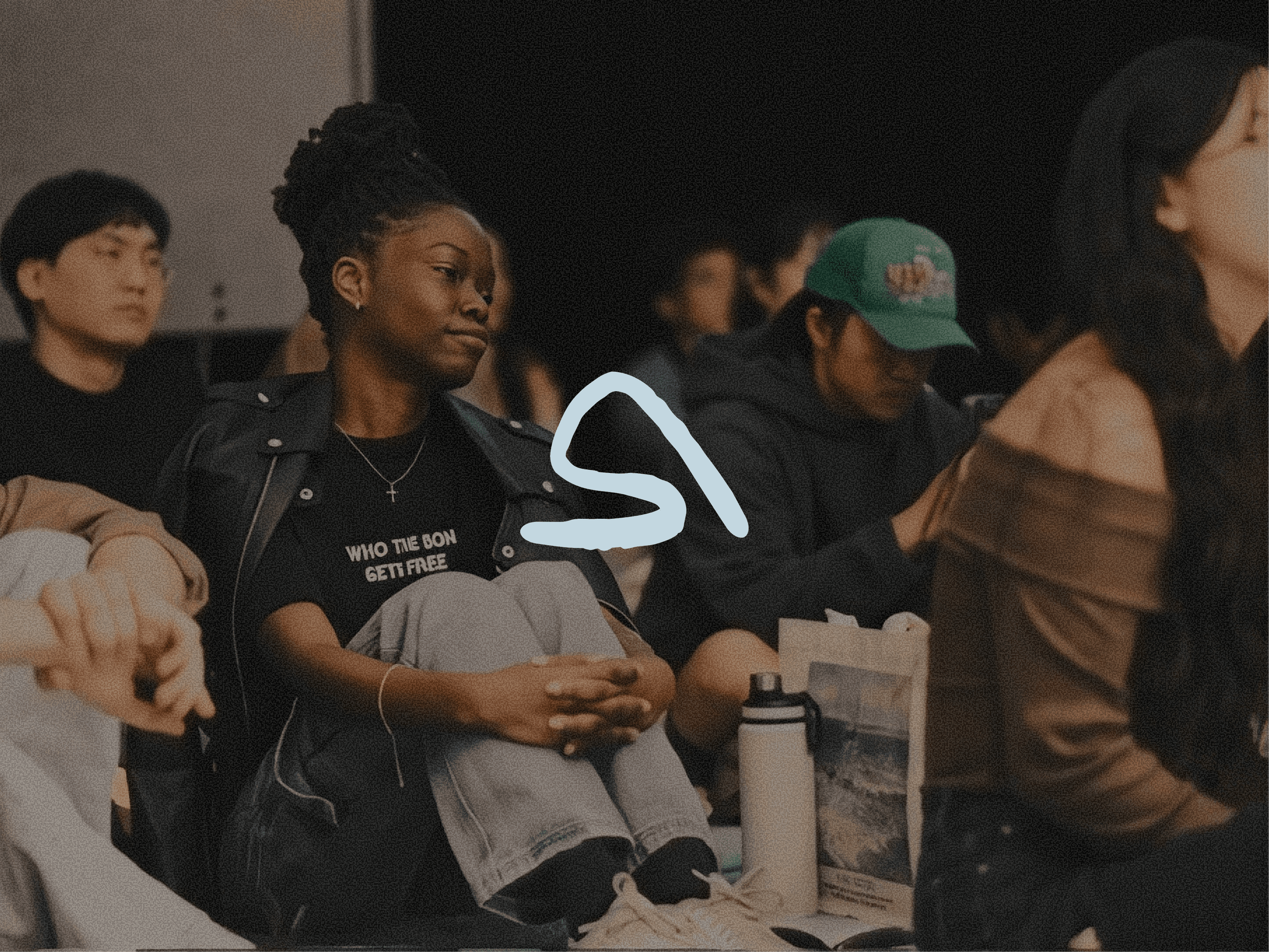
Brand identity for a Christ-centered live music community in NYC that cultivates stages for Christian-Indie musicians.
SION is a Christ-centered live music community creating intimate spaces where Christian indie artists and audiences gather through original music and worship. Built from the ground up, it needed an identity that could welcome people exploring faith, feel credible to NYC's music scene, and still stay rooted in its mission: "We live faithfully in Babylon while leading people toward Zion."
BRAND IDENTITY • SOCIAL • PRINT • EVENT
Role
Brand designer
Collaborators
Nathan Han (Film and Video)
Sally Kim
Year
2026


Finding the gap
Secular shows like Sofar Sounds feel intimate but lack spiritual grounding. Church worship has faith but can feel institutional. SION sits in between, creating a safe, low-barrier, welcoming space for young individuals open to new musical experiences and skeptics exploring faith. Moving the rapidly growing Christian indie music on isolated social media algorithms into a tangible space.

The Idea: Digital Analog
Of five visual territories explored, the final direction blends NYC's internet-native energy with analog textures like risograph and film grain, mirroring SION's mission to meet a fast-paced city where it is and ground it in Christ.

The mark
One geometric stroke combines four ideas: the letter S, a figure kneeling in prayer, an ascending path, and Mount Zion. The graphic identity takes its visual cues from the raw, mountainous textures referenced in its name.


The system
A palette of icy blue, indigo blue, and baby yellow, set in Inter, with full guidelines so the brand stays consistent as it grows.


© 2026 Eunae Ko ݁₊ ⊹ . ݁˖ . ݁· Reflecting my Creator